
GrowTogether
Project duration: 8 months
My role: UX/UI designer
Overview
GrowTogether is an essential pregnancy app designed for people seeking guidance and support as they embark on their journey to parenthood. I undertook this project as part of a case study during the CareerFoundry course to assist those who may feel lost or worried without support.
Research Phase
After identifying a problem statement, I conducted competitor analyses across various existing pregnancy applications. This step was crucial to understand what works well and what's missing in the market. Afterwards I developed SWOT profiles for the most relevant apps.
I also looked into their marketing methods to find areas where my product could offer something different.

DaddyUp
-
~ Peculiar UI with themed vocabulary and illustrations that create a 360 immersive experience.
~ Completely ad free app with no “Premium features”.
~ Exhaustive explanation of most frequent vocabularies used during pregnancy period, and peculiarity of calling the pregnant partner by her name, generating empathy with the user.
-
~ The app is very specific and focused on dads, having no utility for couples of women or single moms.
~ The app doesn’t offer a “Bump photo” feature that allows users to regularly post photos of the growing belly, and it seems to be a requested feature by several users.
-
~ While it has a dedicated “glossary” page, the app lacks of technical explanations and illustrations, making it feel like a game rather than a pregnancy app sometimes.
~ The baby’s size is displayed using comparisons with other things found in the woods, like small insects or animals, but there’s no really way to visualise how effectively it’s growing and what it’s developing week by week.
-
~ Pregnancy apps made mainly for moms that also have a dad section could be a threat, as they may embrace a larger amount of users who can then advertise more the product.
~ Also other pregnancy apps for dads like Hi Daddy who seem to have more resonance and visibility on Google research.

Pregnancy+
-
~ Unique 3D models displayed also in the free version of the app to keep track of the baby’s progress and showing what’s going on inside the mother’s womb.
~ Completely ad free app with many features being available also for non paying users.
~ Lots of articles to prepare mothers before and during the pregnancy, organised in topics like nutrition, body, baby, ecc... with very exhaustive explanations.
~ Clean intuitive interface, with well organised menus.
-
~ Having no difference between the “Mom version” and the “Dad version” is something that could be exploited to create an app that changes accordingly the role of the user, with custom tips and advices based on the choice. In this way the same couple could download the same app and still have two different versions of it that complement together.
-
~ Despite letting you decide what role you play during the pregnancy (mother, father, relative), the app doesn’t change accordingly, essentially showing always the same tips and advices regardless of your choice.
~ The homepage has only a single big section, where many different articles are displayed among with other functionalities like saved names or mom’s weight that perhaps could be better organised on a different section of the app.
-
~ Pregnancy app made for moms that also have a customised dad or general “relative” section could represent a threat, as they could be even first discovered by somebody outside the pregnancy and showed to the direct interested couple.
~ There are other apps like Flo, regnancy App & Baby Tracker or Amma who also have good rating on the app stores and compare in app listing websites.
Key learnings
The competitor analysis revealed a lack of solutions that encompassed all the features I envisioned for my app. This highlighted the need for a unique solution that integrates all these features into a single platform.
The competitor analysis allowed me to compare the common features across different apps and identify the ones I found most compelling. Drawing inspiration from the best aspects of these competitors, I aimed to enhance and improve upon them in my own app features.
User research
During this phase I also conducted user interviews with individuals from the target audience. At the same time, I crafted a survey to learn how people with different cultural backgrounds feel about pregnancy. With all the gathered info, I made three distinct user personas.
User interviews highlighted women's worries about weight gain during pregnancy and its postpartum implications. To tackle this, a nutrition feature was integrated into the app, providing guidance on diet management during pregnancy to alleviate concerns and support healthy weight management.
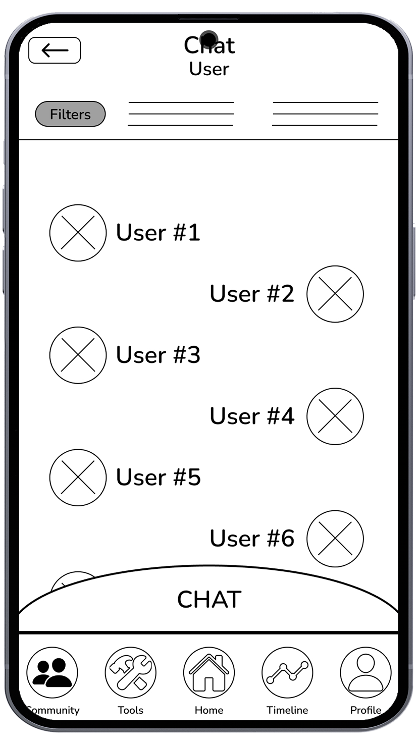
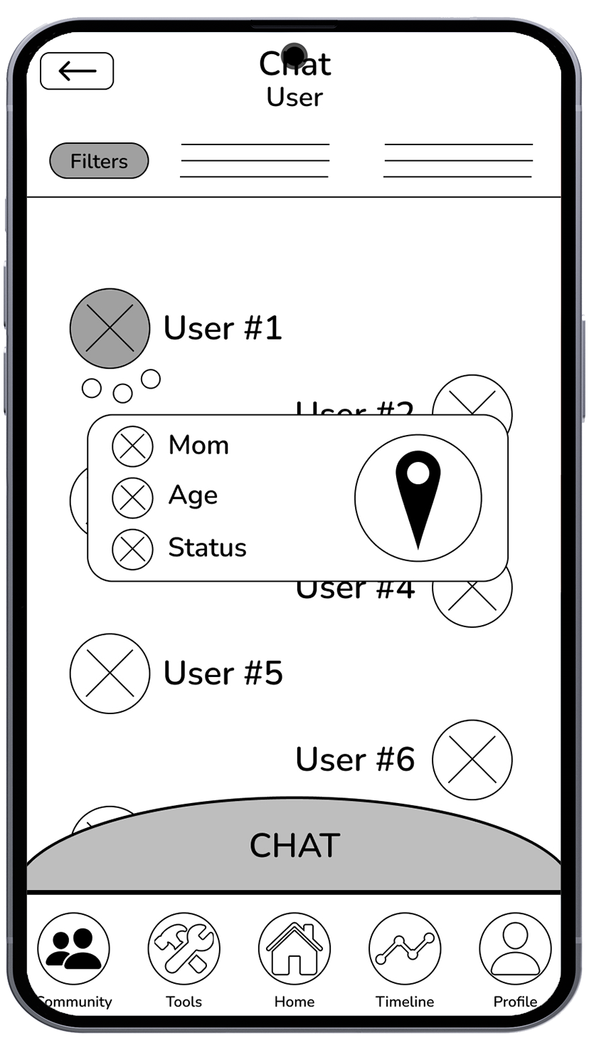
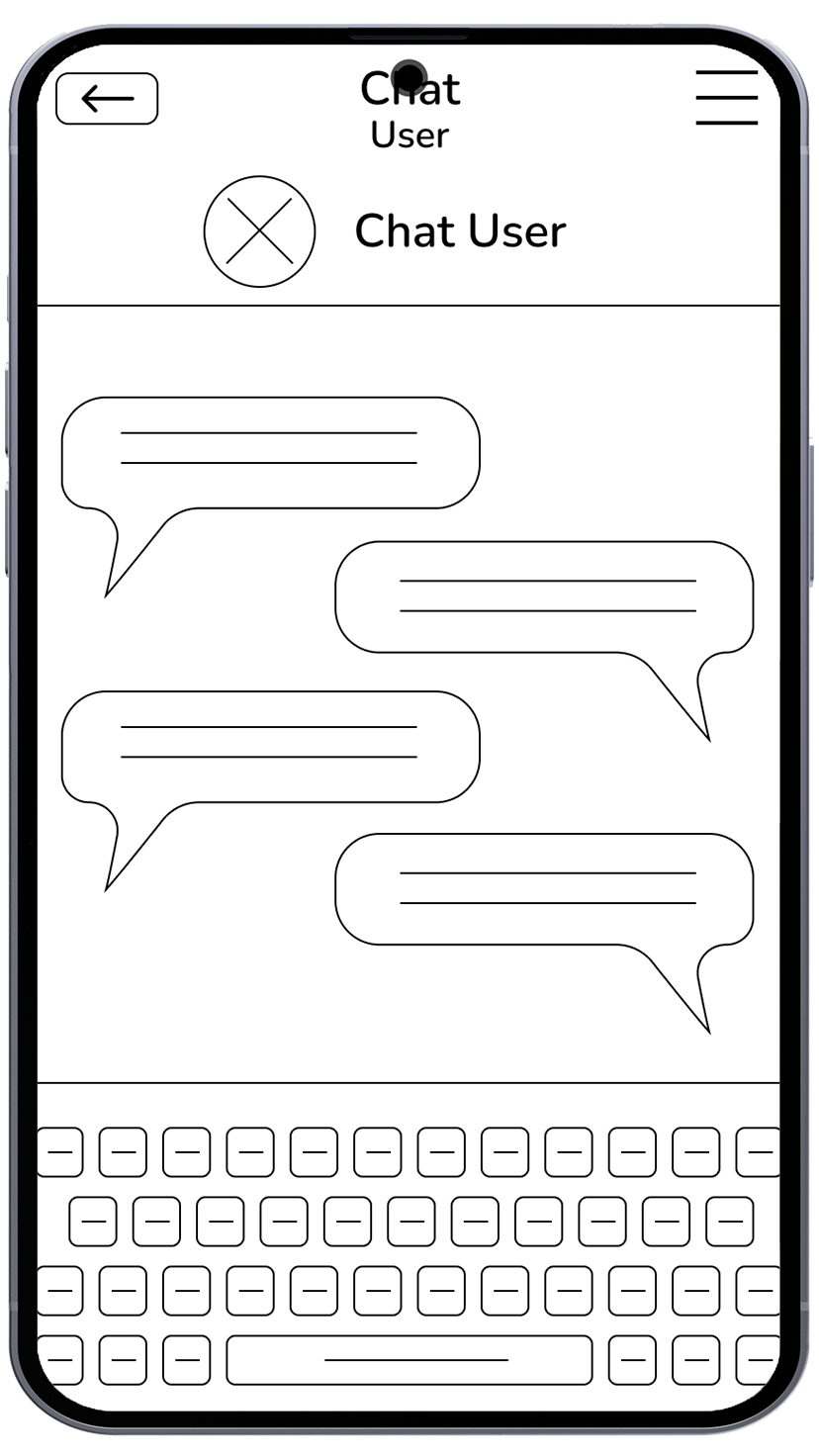
Survey results highlighted the significance of staying connected during pregnancy and the desire to avoid feelings of isolation. I decided to implement a chat feature within the app. This feature enables users to connect with other parents, promoting a sense of community and providing a platform for sharing experiences and support.
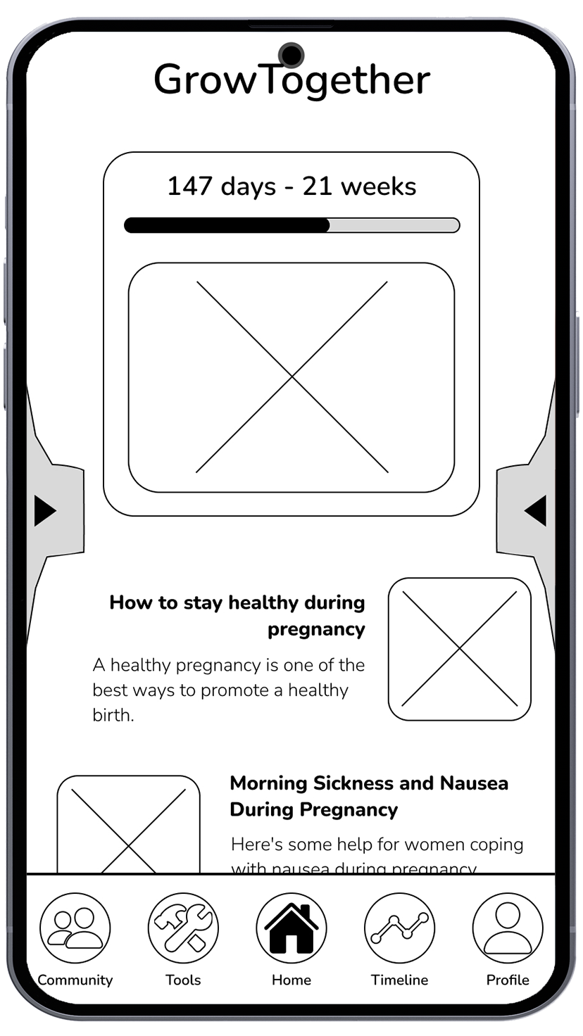
Many users expressed confusion about pregnancy news and practices. To address this, an articles section was incorporated into the app. Articles undergo verification by medical experts before publication, ensuring accurate information and alleviating user concerns about the reliability of pregnancy-related content.
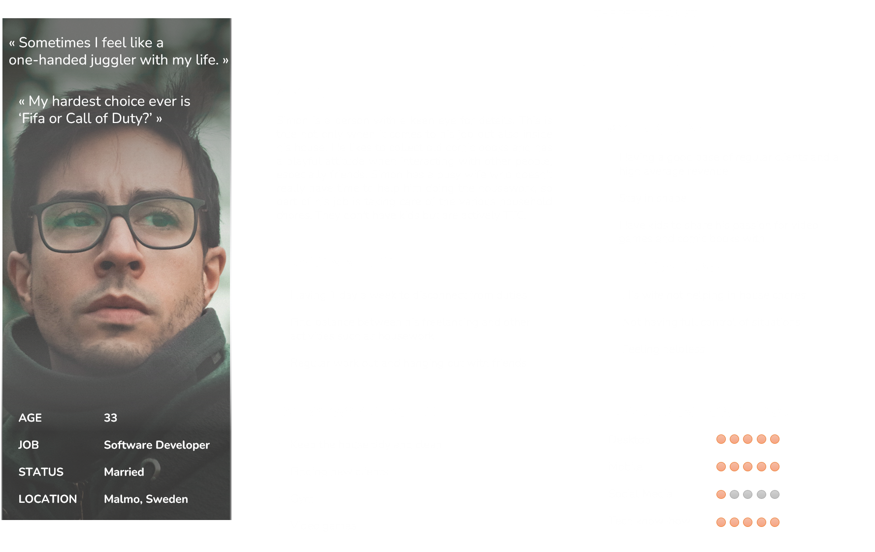
User personas


Takeaways
Empathy toward interviewees and crafting well balanced questions contributed to successful interviews.
Having spare time between interviews was crucial for reorganizing notes and consolidating gathered information.
Effective communication and flexibility enabled successful interviews and surveys, overcoming scheduling obstacles and ensuring smooth discussions.
Design phase
The next step involved the development of a sitemap and a card sorting session to assess the Information Architecture and make any due revision. Using the new map as starting point, I proceeded to design low-fidelity wireframes; and ultimately, after cycles of iterations, I transitioned them into mid- and high-fidelity versions.
These refined wireframes served as the foundation for creating an interactive prototype of the application on Figma.
Clarity
Maintaining an updated sitemap was my main concern, ensuring a cohesive structure for the wireframes, which were developed from scratch. This iterative approach allowed for a well-organized and user-centered design.

Version 2 - I created a separate section which included all the key features of the app.

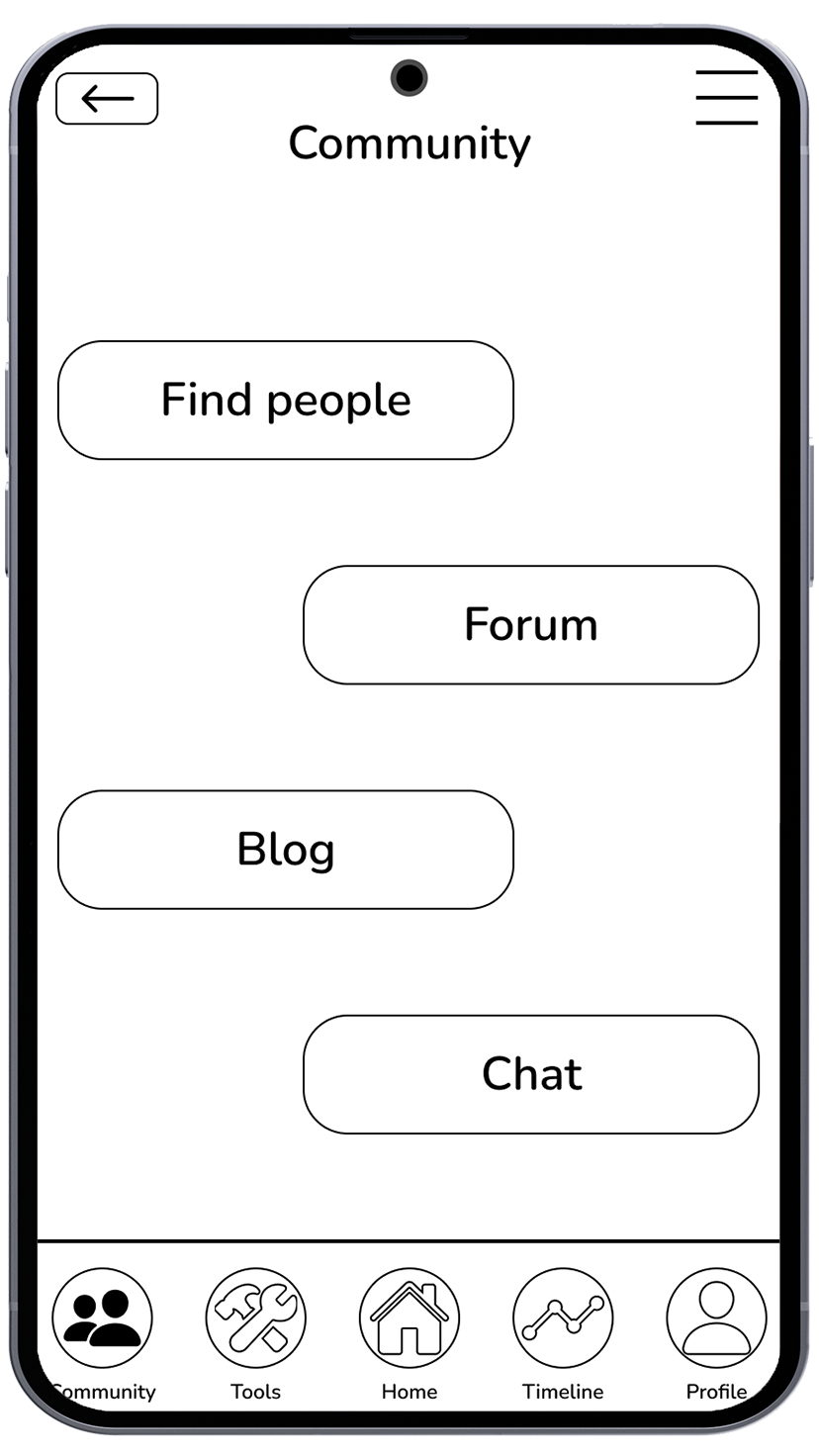
Version 3 - Expanded the Community tab.

Version 1 - Was the very first sketch of the sitemap.


Takeaways
Crafting a sitemap without a preconceived app structure was daunting, as I had many different possibilities to establish a cohesive layout.
Translating conceptual ideas into tangible designs presented its set of challenges, but as I iterated through multiple versions and incorporated feedback, the process gradually became smoother.
Initiating the wireframe design process was hard at first. However, breaking it down into smaller steps led me to a more coherent design approach.
Test phase & refinements
I conducted usability tests with six participants across a span of two days. These sessions aimed to understand how users navigate through the app, why they made certain decisions rather than others, and what emotions they experienced while interacting with the various screens.
Analyzing the recorded sessions, I reviewed participant feedback, iterated on the prototype, and refined it to address any identified issues.
I also conducted a brief preference test across various social media platforms to determine which design resonated better for the onboarding pages.
Test objectives
Understand users’ pain point during the exploration of the app and ask for feedback about the navigation through the various screens.
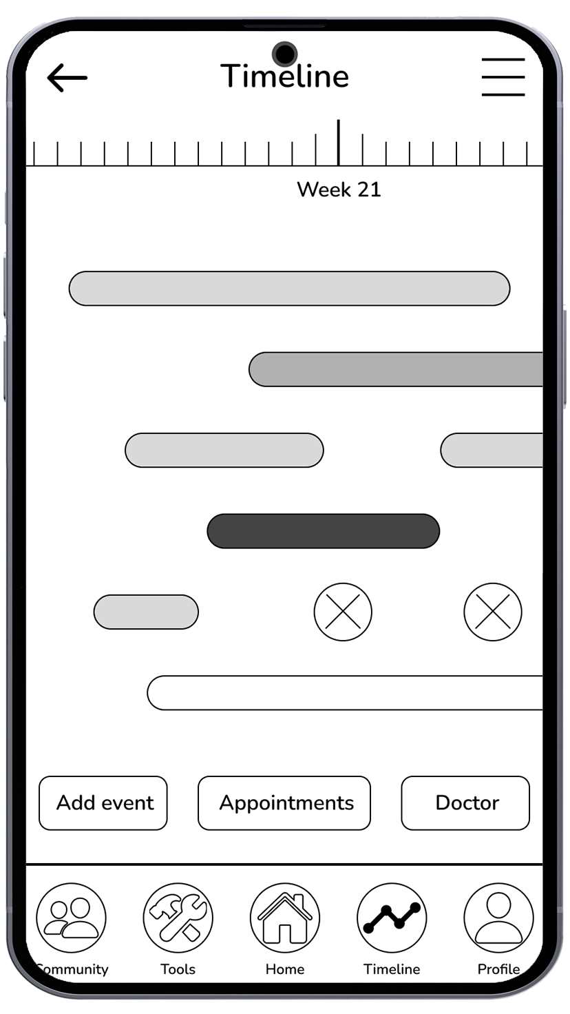
See if users memorize easily the navigation hierarchy and are able to find the chat feature and start a conversation with another user.
Observe how users interact with the meal plan feature and understand if they find the screens intuitive and easy to navigate.
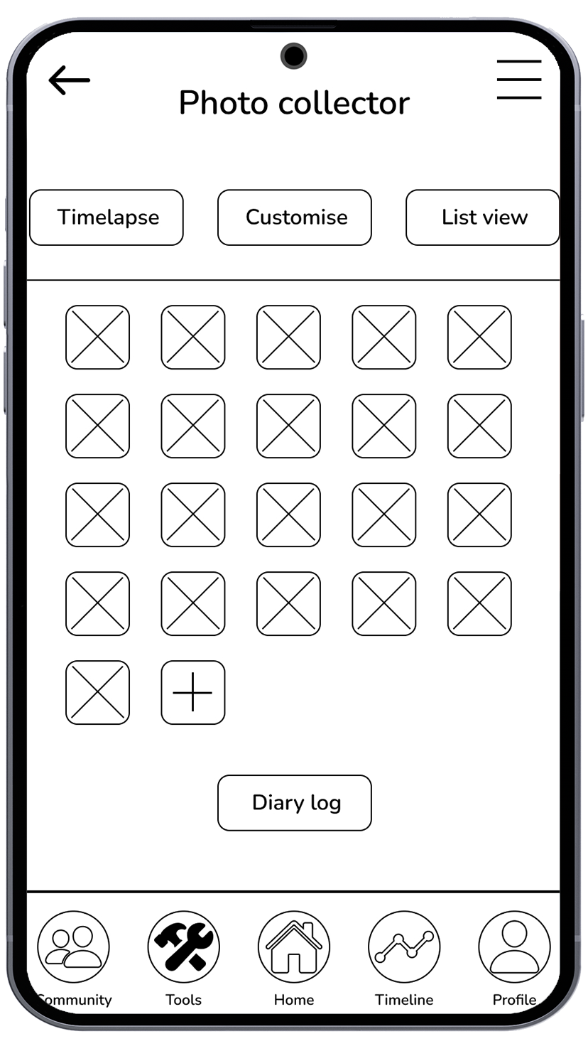
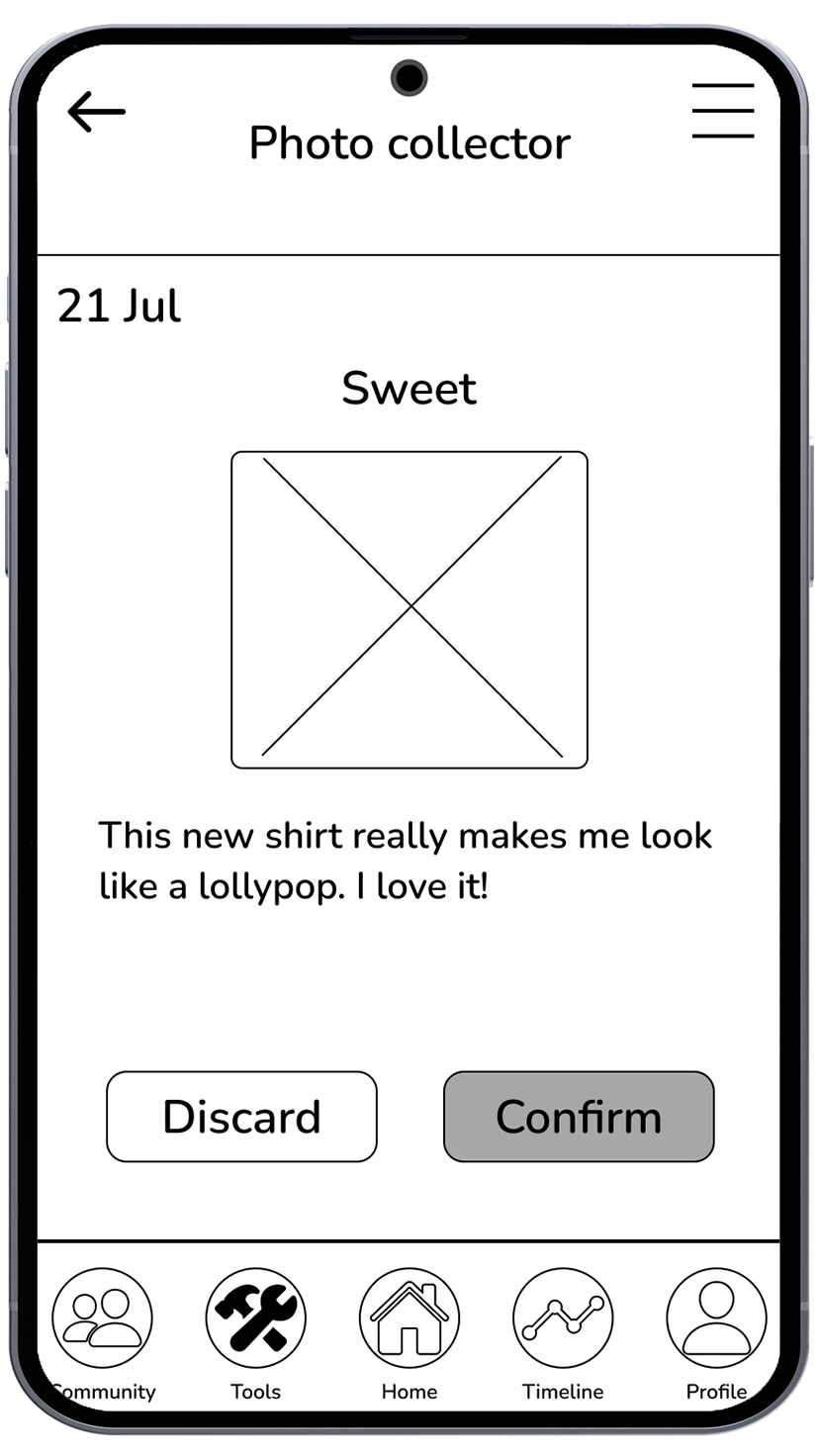
Test the effectiveness of the photo collector feature and see how users navigate across the screens.
Feedbacks


Takeaways
The usability tests showed the importance of empathy and active listening. Creating a comfortable setting and breaking the ice was crucial for encouraging open communication and making the interviewee feel comfortable.
While every opinion mattered, it was challenging to accommodate every individual preference. Instead, I focused on finding common problems and making the app better step by step.
UI elements & accessibility standards
After refining the high-fidelity screens, I transitioned to crafting the app's user interface. Employing a simple color palette and a tailored font, I ensured consistency across all elements. Following Google's Material Design principles, I designed buttons and other components to maintain a cohesive aesthetic throughout the app.
Prioritizing accessibility, I verified that every screen adhered to a minimum AA level color contrast and incorporated features like speech-to-text functionality, color blindness considerations, and minimum interaction box sizes for icons and font adjustments.
Takeaways
Breaking down the design process into smaller steps enabled the gradual development of a cohesive visual style, overcoming initial challenges in creating a unified look for the app.
User feedback played a crucial role in refining the UI elements, highlighting areas where clarity and readability needed improvement, and ultimately contributing to a more user-friendly interface design.
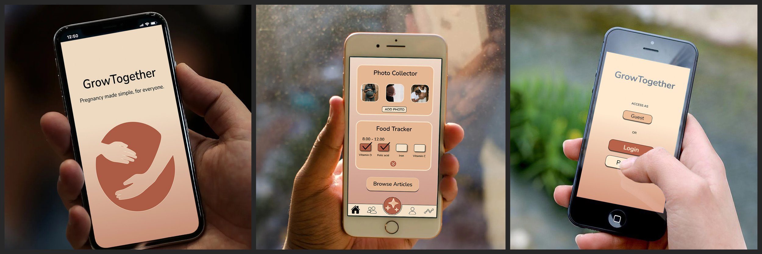
The final outcome!
I am thrilled to present the final screens of my app, which embody all the feedback, iterations and refinements made during this course. Each screen reflects the progress and hard work invested throughout this experience.


Conclusion
Thank you for taking the time to explore this project journey with me.
I'm incredibly excited about the outcomes and the invaluable lessons learned throughout the process. I look forward to the opportunity to apply these learnings and insights to create more impactful and user-centric designs in the future.
Regarding the project, I intend to leave it as it stands for now but remain open to revisiting it in the future. As I continue to acquire new skills and techniques through future projects, I may apply them to further enhance and develop this project.