Perfect Property
Project duration: 3 months
My role: UI designer
Overview
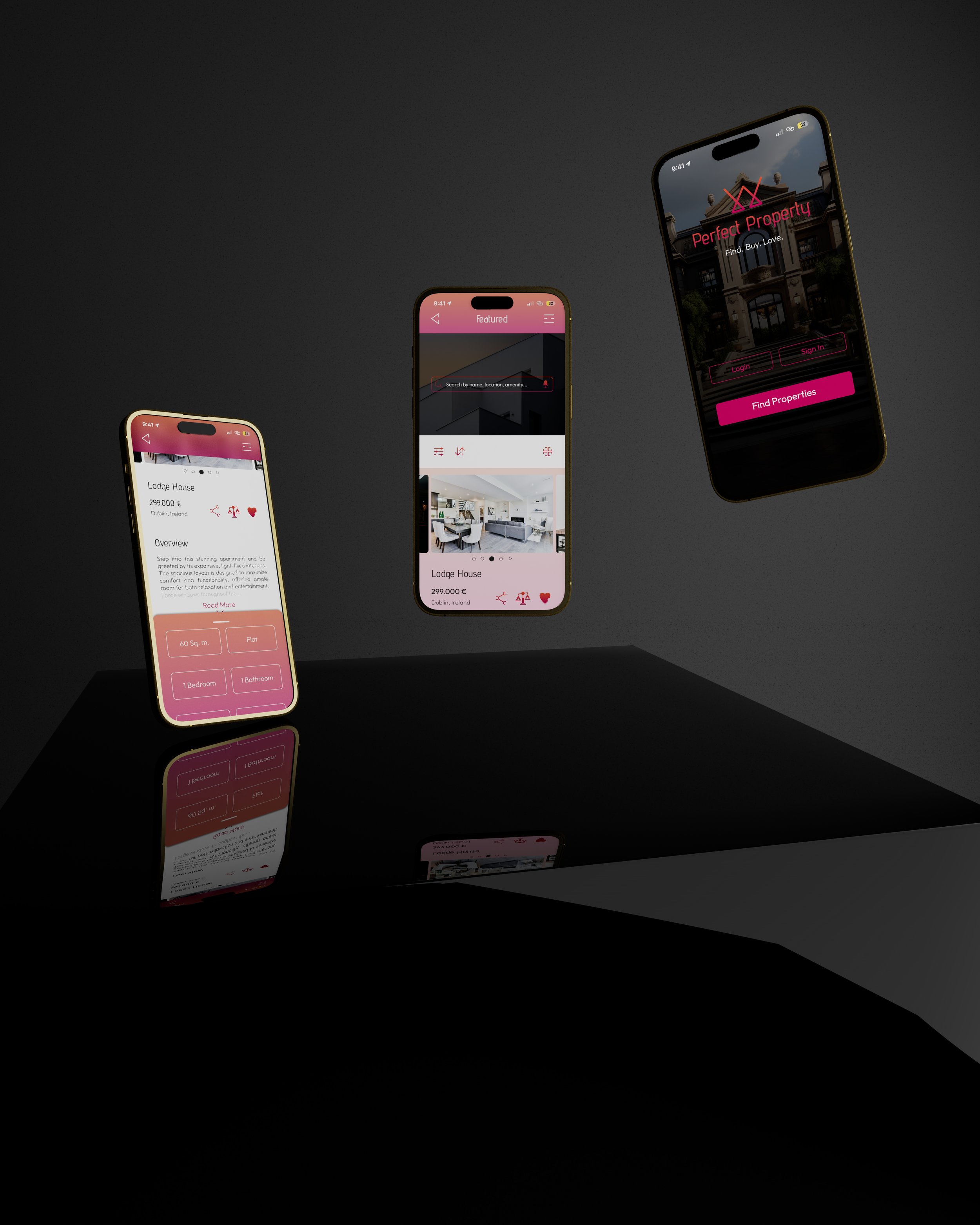
Perfect Property is a responsive web app designed to simplify the property search process for buyers. It aims to assist those new to the real estate market by providing clear and concise information on properties of interest.
Getting Started
The product is intended as a concept project rather than a market-ready app. In this context, the UX research was already completed, and my role was focused on the UI design. With user personas and problem statement already established, the next step was to create a user flow.
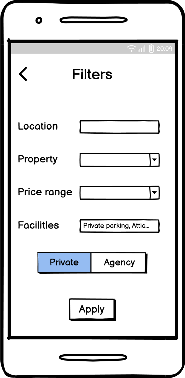
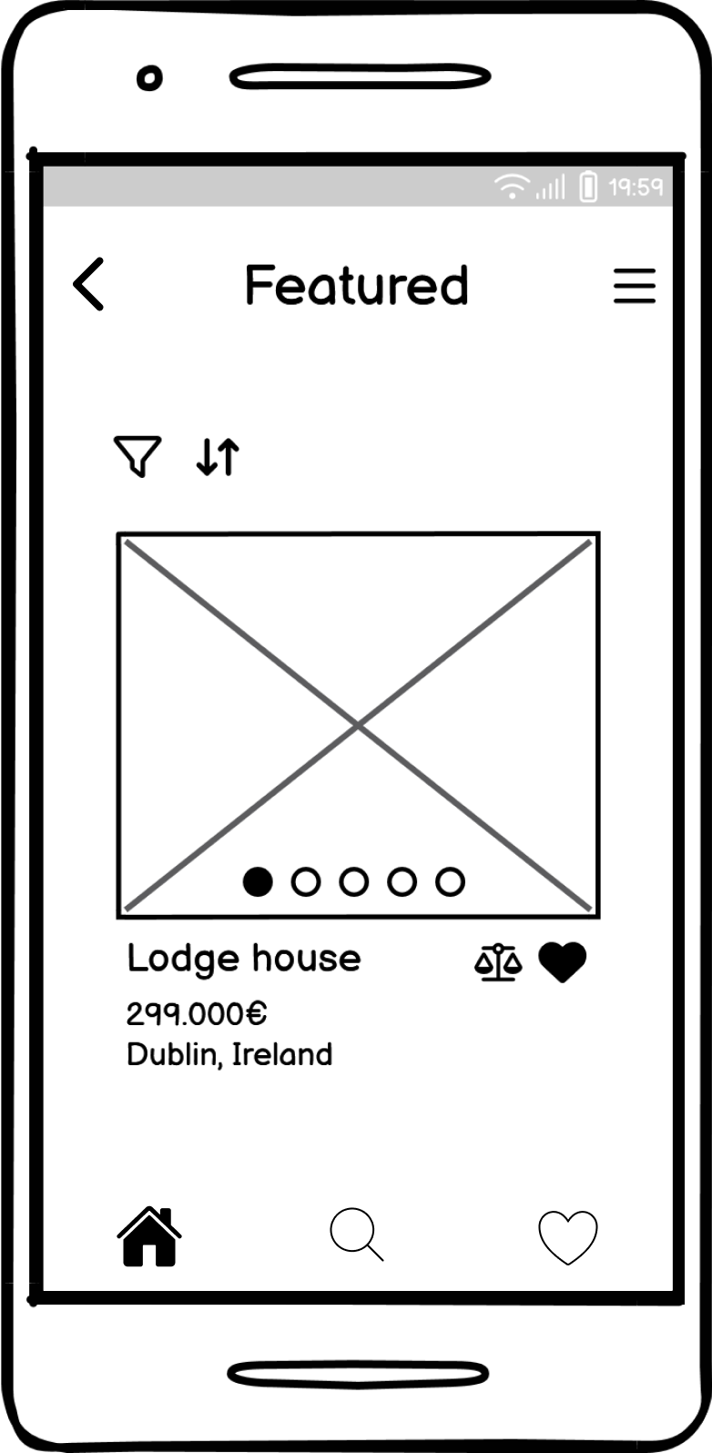
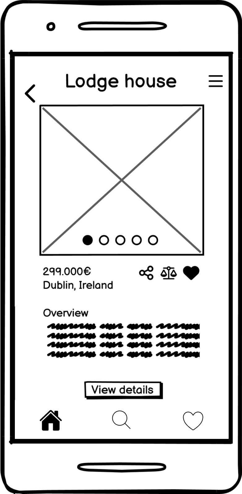
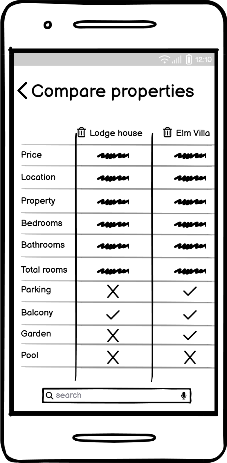
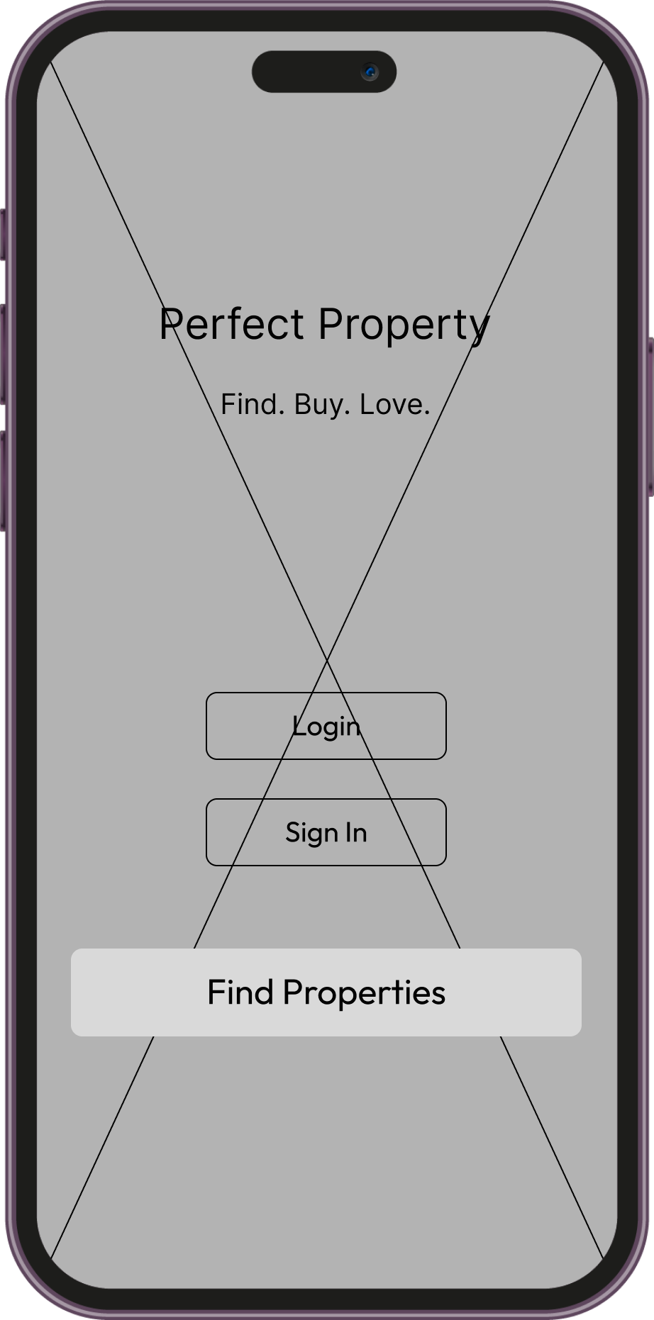
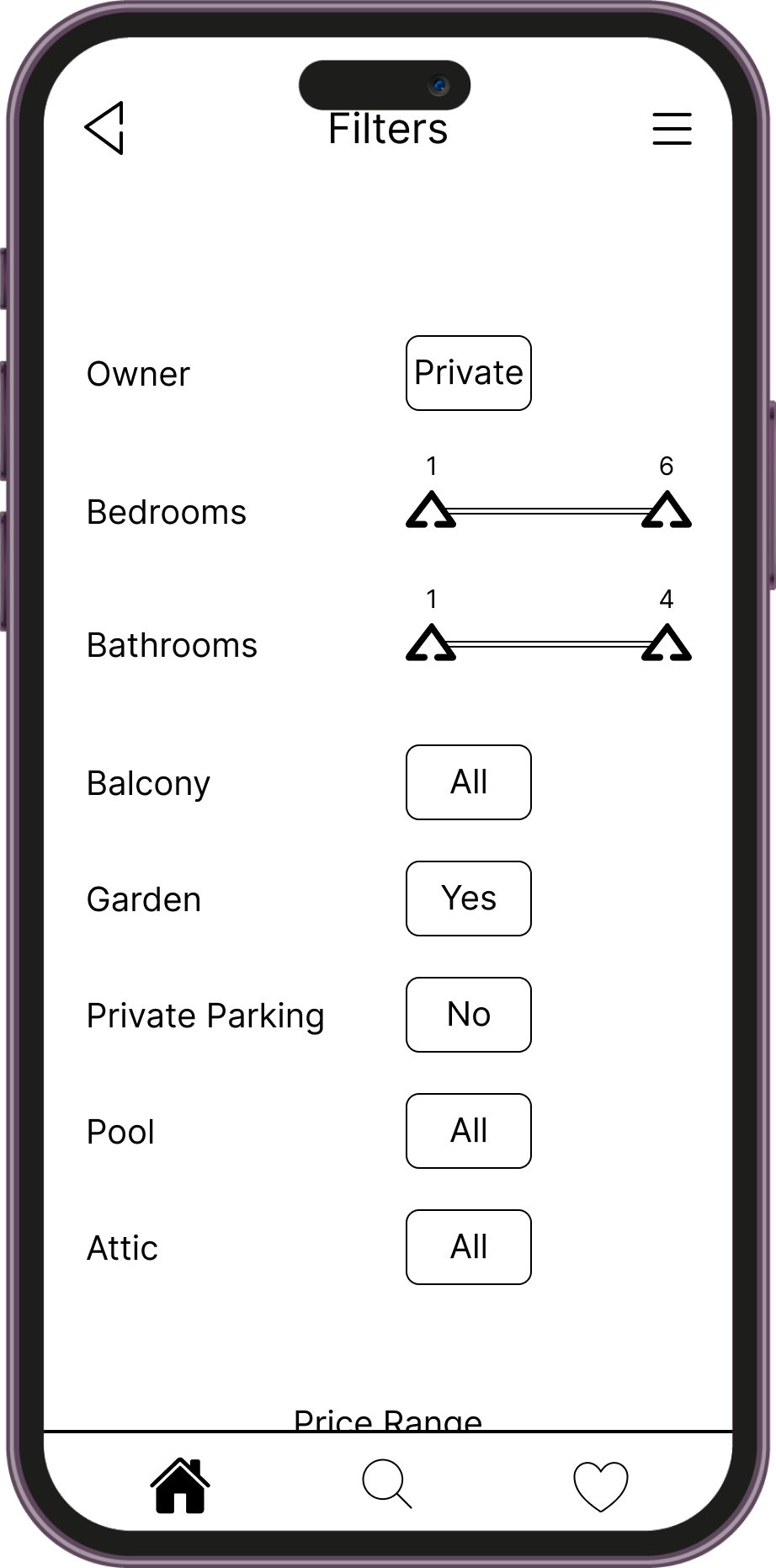
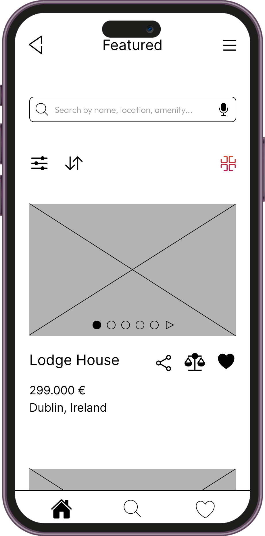
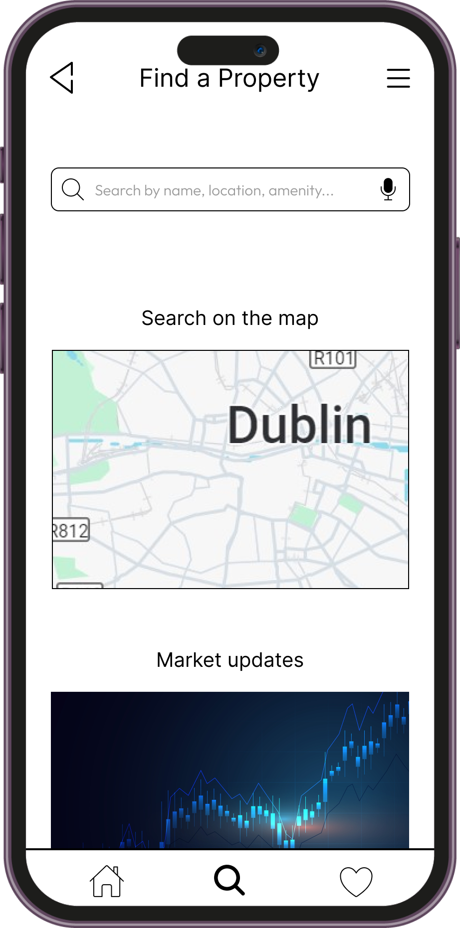
From here, I began sketching low-resolution wireframes, which were later refined into mid-resolution wireframes.




Key points
With much of the UX design already completed, the process moved quickly. However, while creating the wireframes, I needed to focus on critical aspects such as aligning the design with the established user persona and ensuring accessibility.
I prioritized developing a few key screens, such as the homepage first. Then I moved on to the secondary screens to get a broader perspective of the overall look of the app.
Mood Boards
Mood boards played a crucial role in the development of the app's UI, allowing me to explore various styles and moods. I tried to go for different looks, from more clean and neat to warmer and more playful. This process provided an overall sense of the app's look before moving on to high-fidelity designs.
Adding Life to the Project
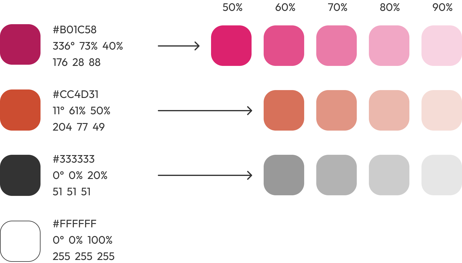
Once I got an idea myself of which direction to take, I started the typeface research, as well as a coherent color palette which better represented the feeling I wanted for my app.
For the selection of the typeface I used the following criteria (in order of relevance):
Sans-serif font from Google fonts;
Typeface with different weights other than regular;
Paragraph still (barely) readable with font size of 15px and zoom set to 30% on Figma;
Proportions between characters’ height and width;
Paragraph width taken by the same amount of characters at same font-size (not too long);
Attention given to size proportions of numbers and special characters such as “€, $, £”;
Personal liking.
The color palette is composed of warm tones to evoke a sense of home and friendliness. It also maintains a strong contrast ratio, ensuring readability at all times by adjusting font size when the text color and background are similar.
Logo and Iconography
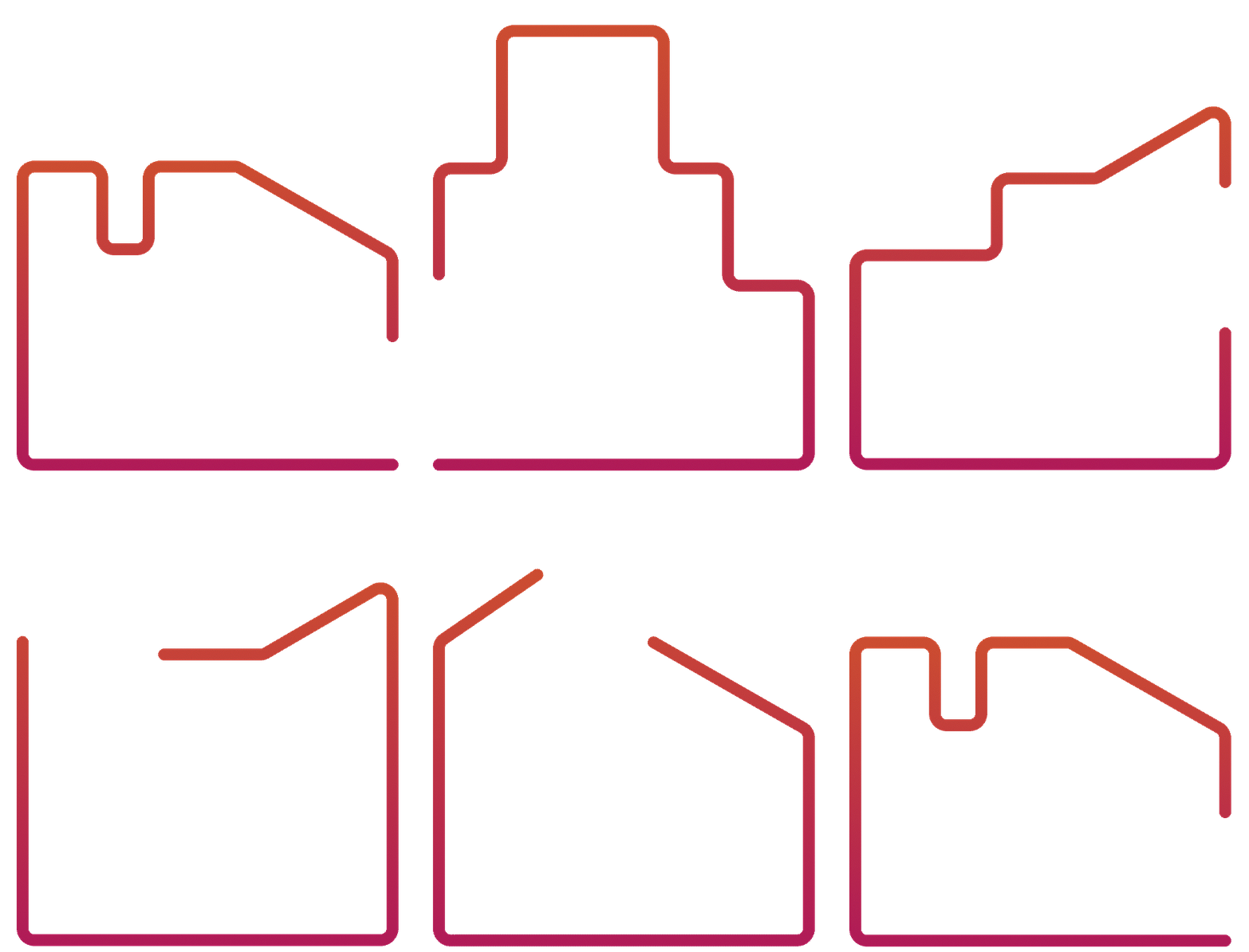
The logo, inspired by the roof of a house, is crafted from simple triangular shapes. It consists of a single continuous line that crosses itself twice to form these triangles. The logo features a 100% linear gradient.
The icons are designed to be simple and easily recognizable, featuring a consistent stroke with an intentional interruption. This common element gives them a cohesive and unified appearance.
Make it move
Creating your profile...
Creating your profile...
Adding animations to the project was by far the most enjoyable part. Starting with the message I wanted to convey, I created several short animations to visually guide the user through the onboarding process. My goal was to create a playful experience and break the ice with the user as quickly as possible.
Although these specific animations were not created as vectors, they were exported in various sizes to maintain consistent quality across different breakpoints, without compromising loading times.
Designing for Breakpoints
Perfect Property was designed as a responsive web app, so the final phase of the project involved adapting the screens for different devices. This process included designing for mobile first and then scaling up to larger devices, ensuring the design remained responsive and functional across various breakpoints.
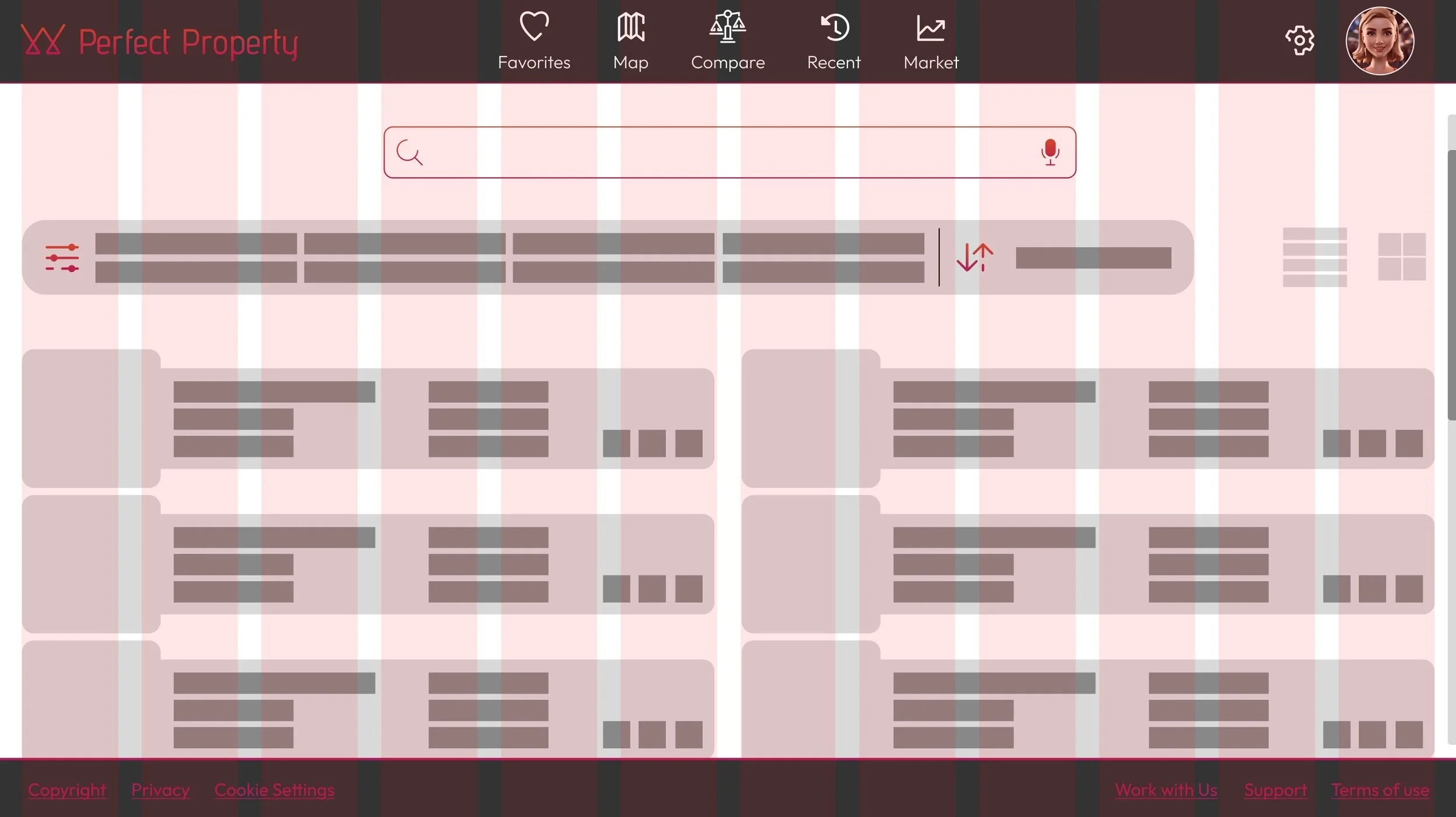
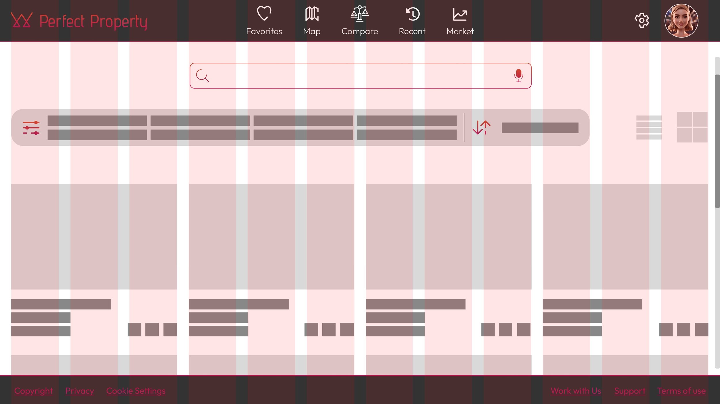
I used a 6-columns grid for mobile and tablet version, while the desktop version is designed with a 12-columns grid. Using a grid enabled me to scale up the design while preserving the same hierarchy and layout for larger screens. I followed the same process by first sketching low-resolution wireframes for tablets and desktops, then refining them into their final versions.
Takeaways
Designing for larger screens might seem easier due to the increased space for placing elements, but it also presents the risk of overcrowding the UI. The main challenge was finding the right balance between a sparse UI and one that feels too cluttered.
As screen sizes increase, it’s crucial to ensure that the most important elements remain prominent and easily accessible. Larger screens can lead to dispersed content, so keeping a clear structure and guiding the user's attention effectively is essential to prevent the experience from feeling overwhelming or disjointed.
Towards new Challenges
I embarked on this journey with an open mind and a spirit of exploration, curious to discover new concepts and techniques. The challenges I encountered along the way provided valuable opportunities to test my abilities and tackle new problems with creative solutions. I particularly enjoyed the process of finding innovative approaches within the constraints set by the project's nature.
As for the project itself, the app is not fully functional, but it's time for me to move on to new challenges. In the future, I may revisit it and rework it with the new skills I’ve acquired.


